
Building a Portfolio That Converts Visitors to Clients
The difference between a portfolio that gets ignored and one that lands jobs. It’s not about having the most projects — it’s about showing the right results.
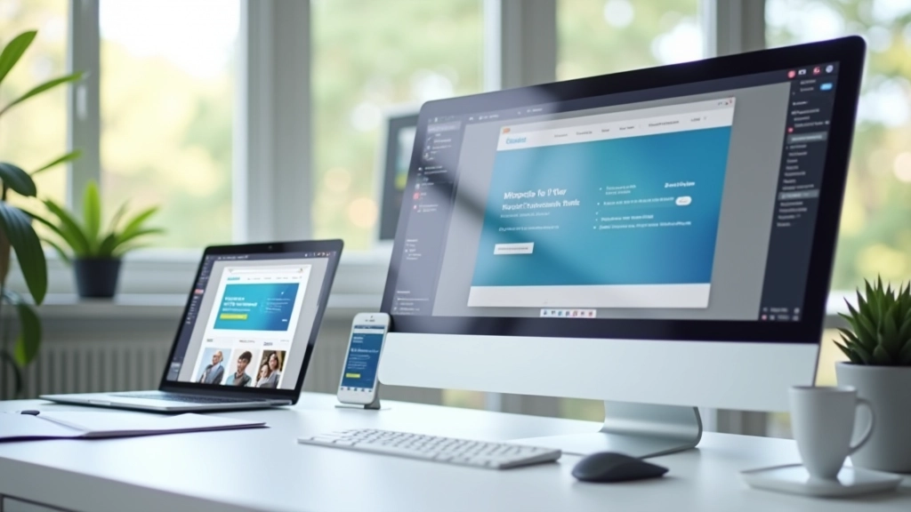
Read MoreYour design choices aren’t obvious to clients. Learn how to explain them clearly without sounding technical.

You’ve spent hours choosing the right typeface, spacing, colors, and layouts. You know why every decision matters. But when you present your work, your client’s eyes glaze over the moment you say “kerning” or “visual hierarchy.” They don’t care about your process — they care about whether it works for their business.
The gap between what designers see and what clients understand is real. It’s not that they’re not interested. They just don’t speak the language. And that’s where most freelance designers lose their confidence, start second-guessing their choices, or worse — let clients override good design with “what feels right.”
Here’s the thing: you don’t need to dumb down your design thinking. You need to translate it. This isn’t about being less professional. It’s about being more effective at getting buy-in for the work you actually want to create.

Every design choice you make should ladder back to something the client cares about. Not “this font has great letterforms.” Instead: “This font makes you look professional because it’s the same style your competitors use, except we’re making yours easier to read on phones.”
Before you even present designs, map your decisions to client goals. What does your client actually want? More customers? Trust from their audience? To stand out? To seem approachable? Keep that goal visible during the conversation. Every color choice, every layout decision, every piece of whitespace should tie back to that goal.
This isn’t manipulation. It’s clarity. You’re not hiding the design thinking — you’re contextualizing it so they understand why it matters to them.


You don’t need fancy vocabulary. You need phrases that bridge the gap between design language and business language. These three work across almost every conversation:
Instead of talking about hierarchy or composition, explain where you’re directing attention. “This guides the eye to your phone number first, because that’s how people contact you.” Suddenly it’s not abstract design — it’s a customer journey.
Frame design decisions around actual user behavior. “People checking their phone on the bus need larger text, so we made headlines bigger.” This makes your work human-centered, not designer-centered.
Help them see the competitive landscape. “Your competitor’s site uses the same blue, so we chose green to stand out.” Now your color choice isn’t subjective — it’s strategic.
Resistance usually means you haven’t connected the design to their goal yet. Someone says “make the logo bigger” — that’s not really about size. It’s about visibility or importance or trust. Ask: “What are you worried won’t get noticed?”
When a client says “this doesn’t feel right,” don’t defend the design. Dig into the feeling. “Tell me what ‘right’ looks like for you. Should it feel more modern? More trustworthy? More fun?” Once you understand the actual concern, you can either adjust the design or show why your current approach already addresses it.
The conversation shifts from “I like/don’t like this” to “Does this achieve what we need?” That’s where you win. Because if the design actually solves the problem, you can show it.

The strongest argument for a design decision is seeing it work.
Show their current site next to your redesign. Don’t talk about it — let them see the difference. Point out one specific improvement: “More whitespace means less clutter. Your visitors won’t feel overwhelmed trying to find what they need.”
If possible, show how the design looks on actual devices. A mockup on a big screen looks different than the real thing on a phone. Seeing it live makes decisions concrete instead of theoretical.
Walk through the design as if you’re their customer. “So a new visitor lands here — they see this headline that explains what you do, then they scroll down to see your portfolio, then they find your contact form.” This narrative approach makes the design feel purposeful.
Every client conversation is different, but your approach shouldn’t be. Before your next presentation, write down three things for every major design decision:
Do this for 3-4 key decisions in your next project. You’ll notice something shift. You’ll stop feeling defensive about your work. You’ll start feeling confident because you can actually justify every choice. And clients feel that confidence. It makes them trust you more.
The best part? Once you develop this skill, you’ll start making better design decisions from the start. You’ll question your own choices using the same framework. “Why am I choosing this color? Can I explain it in business terms? Does it serve the goal?” That’s when you stop being a designer who makes things look nice. You become a designer who solves problems.
This article is educational content designed to help freelance web designers improve client communication skills. Every situation is unique, and what works for one client may need adjustment for another. These are frameworks and approaches based on common challenges in design consulting — not universal rules. Apply these ideas thoughtfully to your own practice and adjust based on your specific client relationships and project contexts.